A landing page is a specific page on your website where an individual ‘lands’ after clicking on your advertisement. These advertisements can be on Google, social media platforms or anywhere else online. Your landing page is a crucial part of your advertising campaigns success, so making sure you follow the best practices is key.
You have around 3-5 seconds to grab someone’s attention on your landing page. When someone lands on your page they should know exactly what your service/product is and what they need to do to get it. This is the main concept you should consider when designing the page. To make sure you achieve this you should focus on following this structure:
- Headline
- CTA (Call to Action)
- Imagery
- Copy
- Social Proof
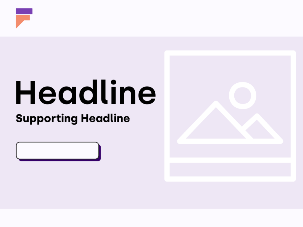
Headline
The headline will be the first thing your audience sees when they click on your advertisement. This means you must communicate clearly what it is that you are offering them and the value of it so your audience knows they are in the right place to find what they need.
You must also craft a headline that closely aligns with your ad copy. The person chose to click on your advertisement for a reason, therefore if the landing page doesn’t match the offer or the intent of the ad, this will disengage the consumer and potentially make them lose trust and leave the page without converting.
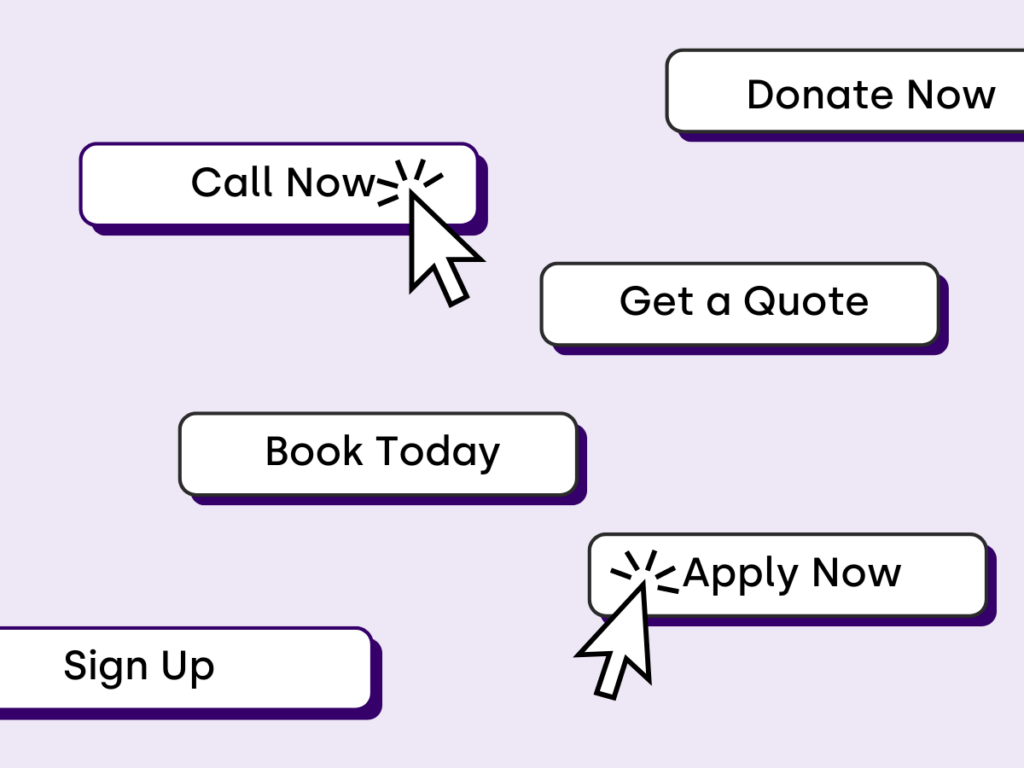
CTA (Call To Action)
CTA stands for call to action. This is about telling your audience what action you want them to take when they visit your page, not making this clear can risk people leaving. On a landing page this could be actions such as a phone call, enquiry form or a sign up. Making sure you repeat the same CTA throughout the landing page creates a better user experience and provides clear instructions on how they can access your product or service.
When creating your CTA, you need to consider what you want your audience to do and when you want them to do it…now! So, make sure it’s clear and engaging.
Imagery
Imagery contributes to setting the first impression your audience will have when they click on your ad. The important thing is to choose images that help you reinforce the message you want to get across and build trust with the audience. People love authenticity so having images of your team and showcasing your work is perfect to set the right impression. You also have access to stock images and generative AI images if you need them. It’s important to consider that although AI and stock images have their place, heavy use of them can feel less authentic to your audience meaning they lose trust and are less likely to convert.
Overall, whatever images you choose for your landing page, they should be highly relevant to the product/service you are advertising to help push that decision for the consumers to complete the desired action.

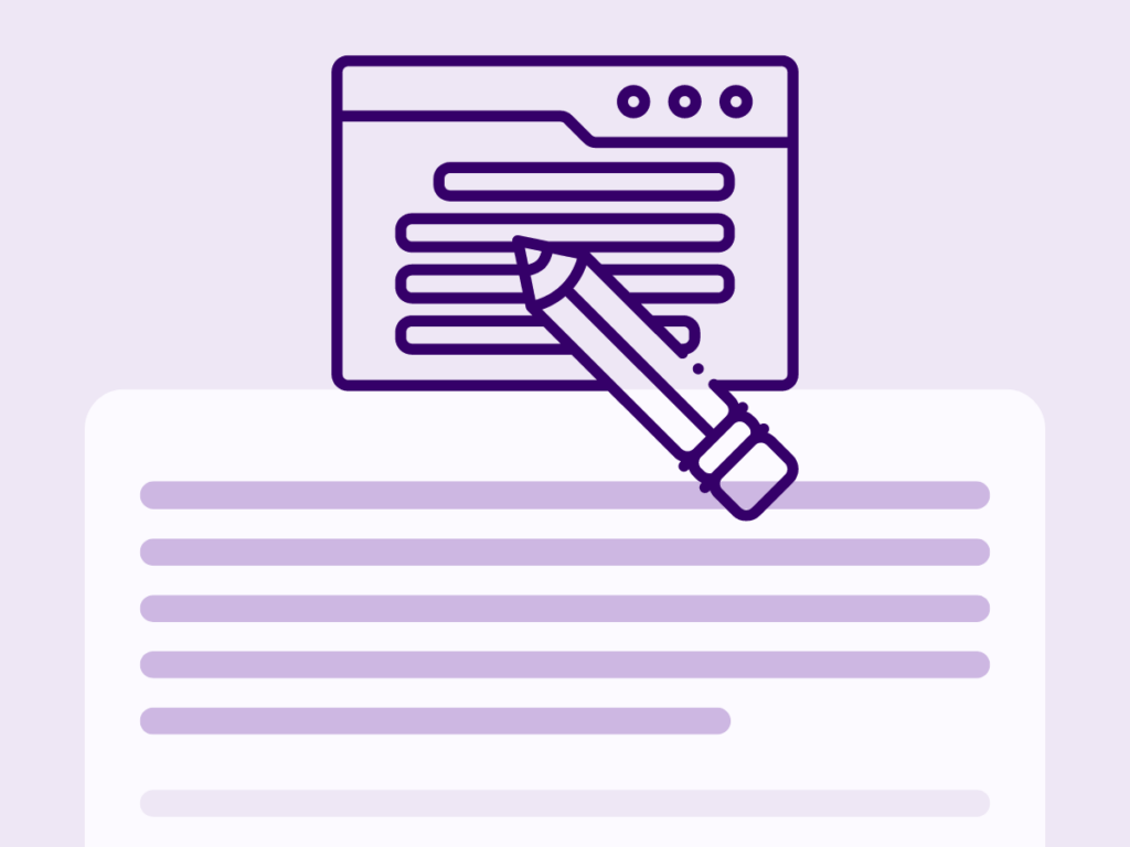
Copy
Your copy will help to connect with the emotions of your audience to explain who you are and what you do. You should include information about your company however the landing page should be all about the audience’s pain points and your solution to these.
For every service or product, the audience you’re targeting will have pain points. You will know what these are for your business, as it’s the problems your customers present to you every day that you help to solve, or it’s even the reason you created the service/product in the first place!
The important thing when you are creating your copy for your landing page is to show empathy to these pain points, while heavily showcasing exactly how you can fix them and why they should choose you.
With the design side try to not make your copy too wordy. You want to engage the audience, so making it digestible and easy to understand is key. If you do have a lot of copy, you could include a condensed summary with a read more option for people who want that extra bit of information.
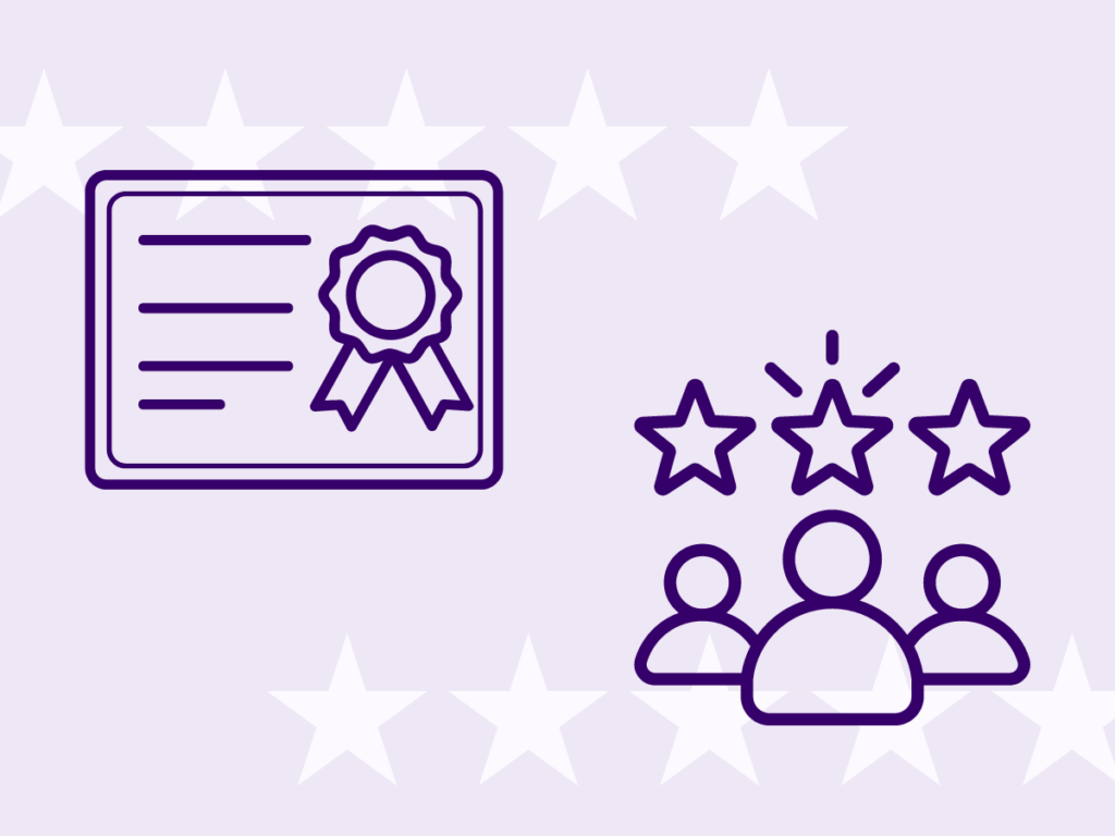
Social Proof
The main reason a potential customer would choose your product/service is because they trust you. The best way to generate this trust is through social proof. Social proof can be reviews, testimonials, case studies, certifications and logos of people you have worked with. Including all of these on your landing page helps to validate what you are offering and make the customer feel at ease that you will be the right choice.
When providing social proof make sure it is relevant to the product/service you are offering through the advertisement. Consider the pain points of your customers and how you can show evidence that you are qualified and have solved these problems before, a great way to do this is through testimonials as it shows people have tried and tested your service/product.
In summary, when implementing this structure you need to be clear with what you are offering and how a customer can easily access it, while providing a showcase of how you can solve your audiences’ problems with evidence to prove this. The main thing is to build trust, and by adopting these best practices you will not only do that, but you will have a successful landing page for your advertisements, that boost your conversions.