On my recent travels, cleverly crafted user experience (UX) on the streets of Hong Kong made me jump with delight. From fun interactive lights on trains to picture communication at restaurants, here are some great examples of UX that I noticed.
1. Project Dignity
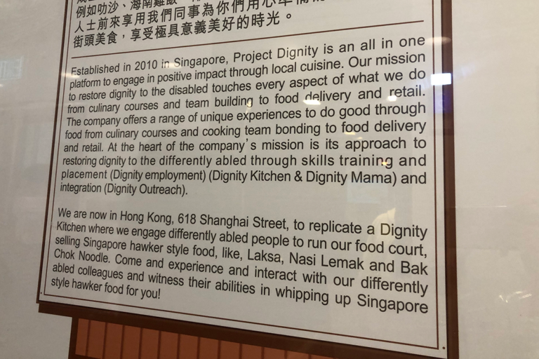
The backstory of this restaurant was displayed at the entrance and heart-warming to read; please view figure 1. Project Dignity employs marginalised groups of people in their community, for example, those who are socially disadvantaged. They help run the restaurant, manage the kitchens and serve customers at the table. My experience as a customer was great! The restaurant staff welcomed us with a smile, helped us order from an image menu and served warm, aromatic food at our table.
You can learn more about their story here.
2. Picture communication
This brings us to how picture communication was used at restaurants and on lifts. As a traveller, it is helpful to learn a few words to share the enthusiasm with the locals and communicate important information, like ‘thank you’ or ‘nut allergy’. Luckily for us, Hong Kong has a strong international presence and attracts many people from around the world.
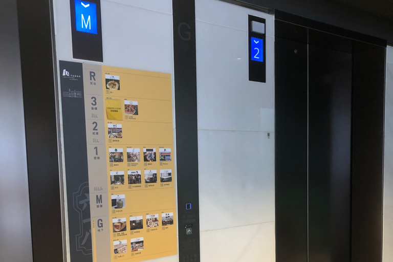
At a shopping centre or building, we found image lists of shops nearby the lifts. These visual signs typically contained the business logo and floor (level) number. This made it easy to visit the intended shops on different floors of a building.
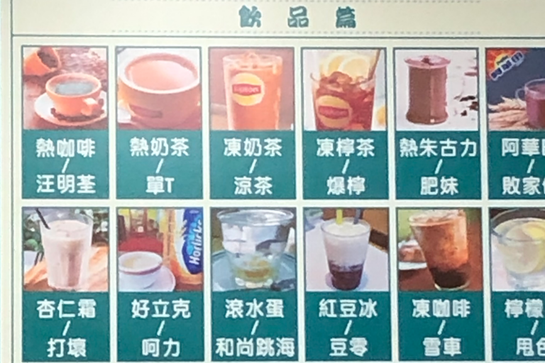
At a restaurant, an image menu was used to communicate food that was available. We were able to make informed decisions quickly and easily, which was essential after a long day exploring. This played an important role in our UX of the restaurant.
As users, we soon learned picture communication was effective and downloaded images of our own to communicate. This was helpful to highlight allergens and any other dietary requirements.
3. Progressive lights
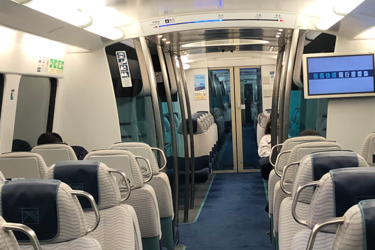
The lights on the train from the airport made me curious. It grew in length, adding more bright dots as we neared the next station. I thought to myself, ‘could this be a progress bar on our position between the last station and the next one? Yes, it is’.
I’ve only seen progress bars on digital products, like the checkout page for an online store, so this was entertaining to observe. This feature informs passengers to prepare to depart and, in the unlikely event of a train malfunction, assess their distance to a train station.
4. Flashing lights
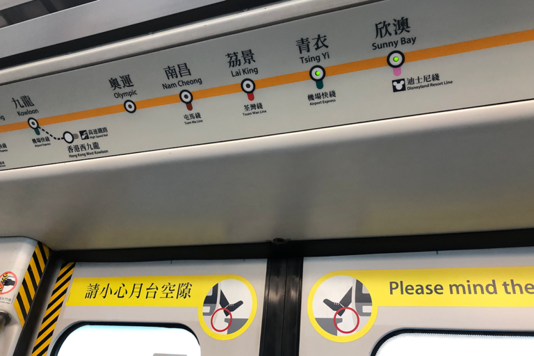
Unlike the train from the airport, local trains use a different approach. While there are sound announcements as you approach the next station, for jet-lagged travellers, the flashing yellow light will keep passengers aware of the next approaching station. The urgent yellow flash grabs attention, keeping passengers informed about the direction of their travels.
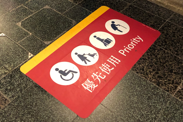
5. Priority sign on the ground
For travelling parents, Hong Kong has a resourceful treat. Hong Kong public transport service, known as MTR, has carefully crafted accessibility signs around the station.
On the ground, highly-visible red signs make life easier for parents, wheelchair users and elderly commuters. Priority signs are in red, a colour typically used to attract attention; as seen on mobile notifications. More so, we were able to see these signs 10 meters away, which meant quicker planning and journey times. We spent less time trying to figure out how to get to the next station and more time moving!
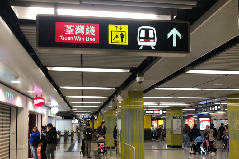
6. Accessibility signs on the ceiling
As a keen observer, looking at the ground isn’t always my first choice. When I travel abroad, I like to digest my surroundings to spot patterns, trends and differences. There were accessibility signs hung from the ceiling of the MTR stations.
Bright, yellow lights with high contrast black text informs passengers requiring accessibility support for lifts. Inside the station, these signs are typically identified from a great distance.
We found this was conveniently located nearby the red signs, mentioned earlier. The designers for the MTR kept the association between red ground signs (for entrance to the platforms) and yellow lift signs (for lifts) close in proximity. I truly appreciate their efforts to keep this consistent across all the stations we visited. This made the experience of using public transport in Hong Kong a positive experience.
7. Visual aesthetics
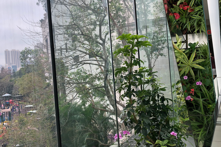
In a city environment, where life is fast paced and the space is dense there are small pockets of joy sprinkled around the city. As we walked through Olympic City (shopping centre) bridge, I noticed plants were placed thoughtfully to offer a green, breathing space for pedestrians. The bridge was decorated with mirrored pillars, sloping at an angle to reflect the plants that lay beneath. This visual aesthetic created an illusion of more plants, than those actually present. Can you spot the difference between the plants and its own reflection?
8. ‘Recycle me’ diagram
Now, most of us try to contribute towards sustainable practises. However, if you aren’t sure how to recycle, a milk carton will show you how to do it correctly. Even if you can’t read the language, a diagram with pictorial images shows what to do and what not to do in steps. How inclusive!

Hong Kong is a bustling city, with lively markets and a diverse community. As a designer, I took great pleasure observing this location. This is my perspective on the beautiful and resourceful streets of Hong Kong!
Thank you for reading 😊
Want to learn more about UX? Find out what UX is in the context of website design here.
– Written by Shah